


TailwindCSS Layout & Structure Cheat Sheet
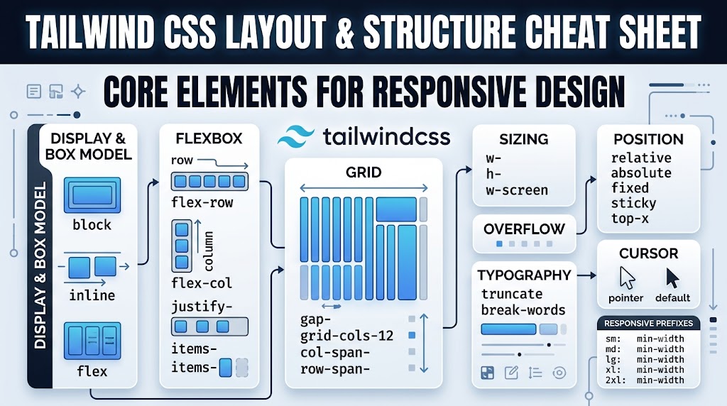
A minimalist, high-efficiency reference guide for structuring web layouts with TailwindCSS. This cheat sheet strips away all visual clutter—omitting color, background styling, and decorative utilities—to focus purely on the core essentials required for structural blueprints, structural positioning, grid systems, and responsive design.
1. Display & Box Model
Defines how elements behave in the document flow and interact with surrounding components.
block— display: block;inline-block— display: inline-block;inline— display: inline;flex— display: flex;inline-flex— display: inline-flex;grid— display: grid;hidden— display: none;
2. Flexbox Layouts
Designed for one-dimensional layouts, aligning components smoothly along a single row or column axis.
flex-row— horizontal flex direction (default)flex-col— vertical flex directionflex-wrap— allow items to wrap to multiple linesflex-nowrap— force items to stay on a single lineitems-start/items-center/items-end— cross-axis alignment (align-items)justify-start/justify-center/justify-end/justify-between/justify-around— main-axis distribution (justify-content)flex-grow/flex-shrink/flex-none— controlling item sizing elasticity
3. Grid Systems
Engineered for complex, two-dimensional structures, managing structural relationships simultaneously across both rows and columns.
grid-cols-1…grid-cols-12— specifies the total number of column divisionsgrid-rows-1…grid-rows-6— specifies the total number of row divisionsgap-1…gap-12— defines uniform gap pacing between grid componentscol-span-x— forces an element to span across a specific number of columnsrow-span-x— forces an element to span down across a specific number of rows
4. Sizing Framework
Controls the structural dimensions of containers relative to parent boundaries or the viewport window.
w-auto/w-full/w-screen/w-[size](e.g.,w-32or custom dynamic extensions likew-[450px])h-auto/h-full/h-screen/h-[size]
5. Padding & Margin spacing
Manages structural whitespace distributions using Tailwind’s integrated linear numeric spacing intervals.
p-x/px-x/py-x— padding adjustments affecting inner boundaries (wherexrepresents structural intervals like 0, 1, 2, 3…)m-x/mx-x/my-x— margin properties defining outer block isolation spacing
6. Positioning Elements
Removes elements from the regular document flow to anchor layouts relative to parent frames or fixed viewport paths.
static/relative/absolute/fixed/stickytop-x/right-x/bottom-x/left-x— precise spatial offsets matching spacing scalesz-x— layering overrides defining stacking priority (z-index)
7. Overflow Handling
Governs how layouts isolate content structures that exceed parent dimensional limits.
overflow-auto/overflow-hidden/overflow-scroll/overflow-visible
8. Structural Typography Utilities
Basic structural constraints applied to text containers to preserve layout integrity from text layout overflows.
truncate— crops overflow lines cleanly with an ellipsis markerbreak-words/break-normal— dictates word-breaking behaviors on narrow screen columns
9. Cursor Indicators
Informs the interface user how to interact structurally with specific touchpoints.
cursor-pointer/cursor-default/cursor-not-allowed
10. Responsive Design System
To make any layout utility on this list responsive, prefix the utility class name with the corresponding target breakpoint screen width. The utility will activate at that screen threshold and scale up across larger dimensions.
| Breakpoint Prefix | Minimum Width Constraint |
|---|---|
sm: | 640px (Mobile environments) |
md: | 768px (Tablet layouts) |
lg: | 1024px (Laptop viewports) |
xl: | 1280px (Desktop monitors) |
2xl: | 1536px (Ultra-wide screens) |
Responsive Architecture Tip: Always construct your structural layouts targeting mobile sizes first. Use your clean base utility classes (
flex flex-col w-full) without any prefixes to define the baseline layout, then introduce un-prefixed viewport wrappers (md:flex-row md:w-auto) to scale your structural boundaries seamlessly as screen real estate expands.