


Core Principles of Art, Concepts and Tips
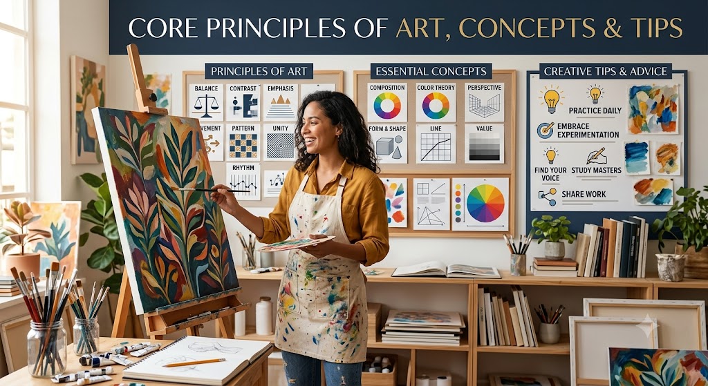
#art #principlesofart #drawing
1. Composition & Balance ⚖️
- Rule of Thirds – Dividing an image into 3x3 sections for better balance.
- Golden Ratio – A mathematical proportion often found in nature and art.
- Symmetry & Asymmetry – Creating harmony or dynamic contrast.
2. Contrast & Hierarchy 🔥
- Contrast – Using light vs. dark, bold vs. soft, or different colors to make elements stand out.
- Visual Hierarchy – Arranging elements to guide the viewer’s eye naturally.
- Typography Hierarchy – Making text more readable by adjusting size, weight, and placement.
3. Color Theory & Mood 🎨
- Complementary Colors – Colors opposite on the color wheel create strong contrast.
- Analogous Colors – Colors next to each other create harmony.
- Warm vs. Cool Colors – Warm colors feel energetic, cool colors feel calm.
- Color Psychology – Different colors evoke different emotions.
4. Perspective & Depth 🏞️
- Linear Perspective – Using vanishing points to create 3D depth.
- Overlapping & Scale – Making closer objects larger and background objects smaller.
- Atmospheric Perspective – Distant objects fade in color and contrast.
5. Gestalt Principles 👀
- Figure-Ground – How the brain separates objects from the background (like negative space).
- Proximity – Objects close together are perceived as a group.
- Closure – The brain fills in missing information to complete an image.
6. Texture & Detailing ✍️
- Visual Texture – The illusion of texture in digital or flat media.
- Tactile Texture – Real texture that you can feel in traditional art.
- Minimal Detail vs. Hyperrealism – Deciding how much detail to include for impact.
7. Motion & Flow 🔄
- Leading Lines – Lines that guide the viewer’s eye across the artwork.
- Rhythm & Repetition – Repeating elements for a sense of movement.
- Implied Motion – Positioning objects to suggest movement or direction.
Each of these concepts enhances depth, engagement, and clarity in your art and design. Which one do you want to explore more? 🚀